Google's HiLight feature on the Pixel 11 Pro employs ambient lighting to enhance notifications and will expand with messaging capabilities soon.
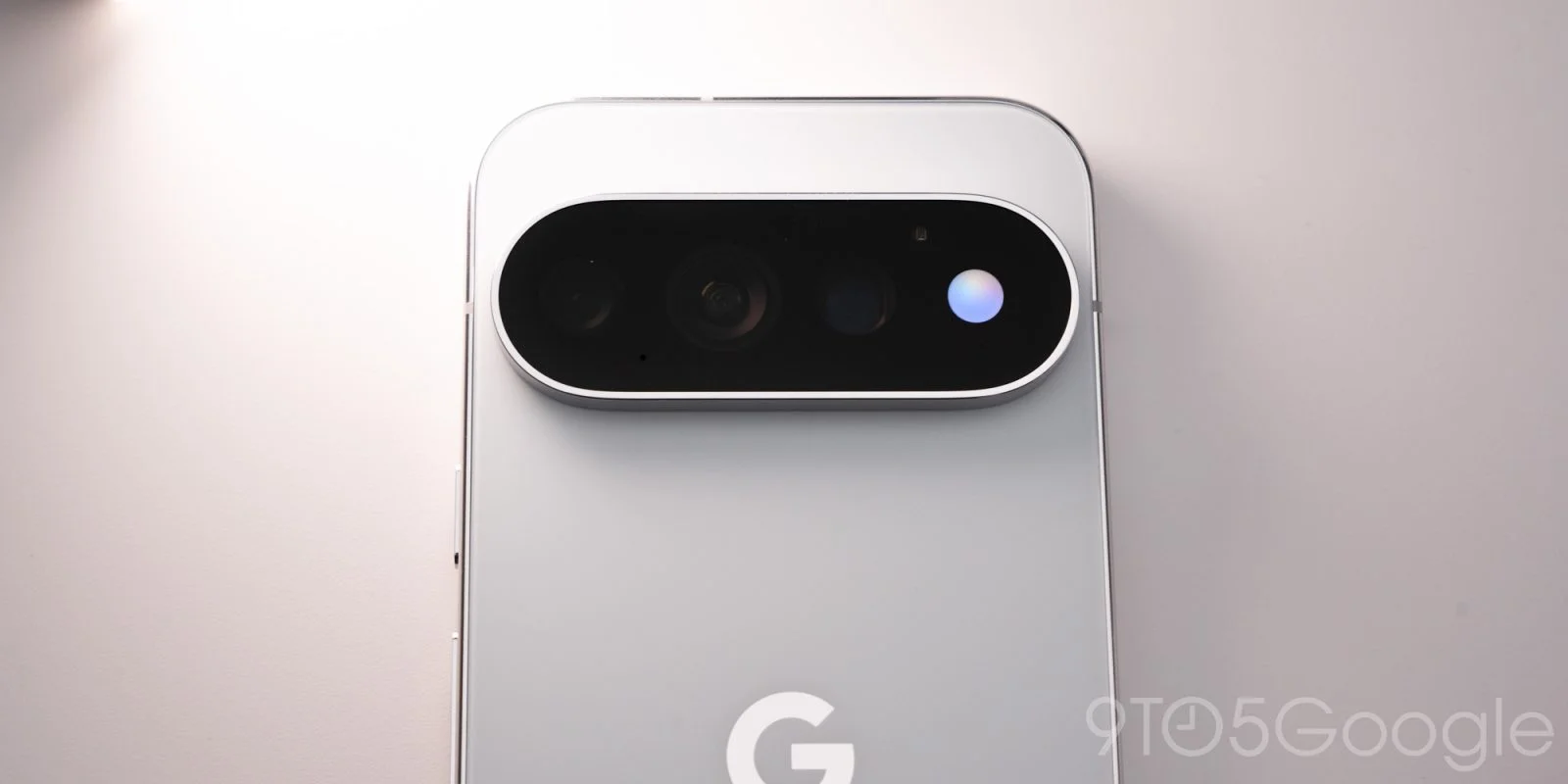
With the release of the Pixel 11 Pro, Google has unveiled HiLight, an intriguing new hardware feature designed to refine user notifications through visual cues. This isn't just a minor update — it's an effort to make smartphone interactions more intuitive and visually engaging.
Design Integration and User Experience
Exclusive to the Pixel 11 Pro, 11 Pro XL, and 11 Pro Fold, HiLight consists of an array of LED lights surrounding the camera flash. On the Pro and Pro XL models, this feature is situated to the right of the camera bar, whereas on the Fold, it’s located in the top-left corner.
The positioning of HiLight reflects Google's design ethos — it's functional yet subtle enough not to disrupt the overall aesthetic of the phone. This visual element could be a game-changer in how notifications are perceived. Instead of relying solely on audible alerts or vibrations, which can be intrusive, the visual cue provided by HiLight allows for a more peaceful interaction with the device. This might resonate especially with users who oftentimes find themselves in environments where sound notifications are inappropriate.
Operational Functionality
HiLight, a playful term for both "highlight" and "hello light," activates when the phone is face down, serving as a visual indicator for incoming calls from designated contacts. This function enhances the existing Flip to Shhh feature and works specifically with the Phone by Google app and WhatsApp. We'll see how quickly users adapt to this feature, but the potential for avoiding missed calls is significant.
What's distinctive here is the user control over the experience. Users can assign one of five distinct colors to their favorite contacts through the Contacts app, which Google has optimized for visibility. For instance, you might opt to assign each of five contacts a unique color or standardize one color for family members while using different shades for friends. The logic behind color associations is sound: our brains process color-coded information quickly, which could help users identify who’s calling without even picking up the device.
Interaction with Existing Features
When a call comes in, simply tapping the power button turns off the HiLight glow. This straightforward method of dismissing notifications may improve the user experience. The ease of use reflects broader trends in tech design, where simplicity often enhances functionality. Users seeking efficient communication tools are likely to appreciate an intuitive interface, especially one that aims to reduce the small annoyances that can accumulate in daily smartphone interactions.
Additionally, the feature also acts as a Gemini indicator that provides visual feedback when the device recognizes “Hey Google.” Users can customize the light patterns to represent different states: listening, processing, and responding. This adds an interactive layer to Google's virtual assistant, making it less of a passive tool and more a visual partner in the user’s daily life. While many might assume vocal prompts would suffice, visual cues add both clarity and tactility to interactions.
Future Potential and Limitations
Currently, the potential for HiLight to notify users of messaging events is on the horizon, but it’s unfortunate that this functionality isn’t available from launch. The timeline for support from third-party applications remains ambiguous. This is a downside, particularly when one considers the messaging landscape dominated by countless apps like Telegram or Signal, which users frequently rely on. A feature like HiLight seems designed to broaden the scope of notifications, yet its limited launch capabilities could hinder initial adoption.
This brings us to a broader point: the efficacy of such features often hinges on their adaptability within existing app ecosystems. If Google can educate developers on integrating HiLight into their apps, it could open the door for a richer user experience. But, if developers lag or show reluctance, the feature could lose momentum and become another footnote in smartphone history. (and this is the part most people overlook)
Implications and Significance
What this means for you, the user, is that HiLight stands at the intersection of functionality and personalization. It might look trivial on the surface, but these small enhancements can lead to a more intuitive user experience. For Google, it’s a chance to solidify its positioning in a market where tactile interactions are increasingly valued.
The introduction of HiLight can also be seen as a response to trends in notification fatigue. As smartphones become central to more aspects of our lives, designing features that streamline our interactions is essential. This is more significant than it looks. Not only is HiLight a feature, but it symbolizes a broader shift in user experience design—highlighting the need for personalization and clarity in how we receive information. Users want their devices to work for them, not the other way around.
As we look ahead, it’ll be interesting to see how Google evolves this feature and how they respond to user feedback. This could be an opportunity to refine not just HiLight, but the entire notification system on their devices. If successful, this move might prompt other manufacturers to rethink their own notification strategies. The stage is set; how these trends play out could redefine aspects of mobile communications in the coming years.
Discussion
Sign in to join the discussion.