Google's recent Pixel 11 launch brings updated app icons for Camera, Weather, Recorder, Calculator, and Clock, enhancing their design coherence.
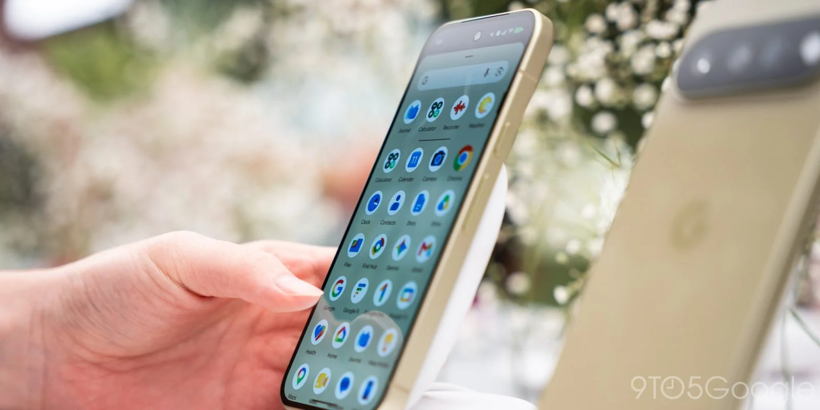
With the recent introduction of the Pixel 11, Google has revamped the icons for several Pixel apps to reflect a modern design aesthetic more closely aligned with its latest style guidelines. This move signifies not just a minor aesthetic update but hints at a broader strategy by Google to unify its brand identity across all platforms.
Rethinking Iconography
The redesign of app icons isn’t merely about aesthetics; it’s a consideration of user experience and brand coherence. Over the years, the tech industry has witnessed various companies reinterpreting their brand through visual elements. Apple's flat design, for example, set the stage for a trend that many companies followed. What you're seeing with Google's latest efforts is a similar desire to refresh and modernize. By adopting this new visual language, Google is aligning itself with current design trends while ensuring that its products feel cohesive across devices.
Pixel Camera
The most notable transformation is seen in the Pixel Camera icon, which retains its DSLR-like essence. This update features a refined rectangle shape portraying the flash and viewfinder, alongside a new Pixel blue color palette that symbolically nods to the integration of machine learning and AI within the app. This change arrives in conjunction with a substantial enhancement to the in-app viewfinder. With multimedia and photography taking center stage in smartphones today, Google ensures that its camera function remains a standout feature, both visually and technologically.
Weather and Recorder Apps
In the Pixel Weather update, the icon's background shifts from a blue hue representing the sky to a more minimalist appearance. This reduction in complexity indicates a design philosophy that prioritizes user engagement—less distraction means a more focused user experience. Overall, there haven't been significant changes to the Weather app itself. It's possible that Google is providing subtle visual cues that suggest freshness without overwhelming users with functionality changes. Similarly, the Pixel Recorder icon now features a simplified red waveform design with less detail, promoting a more stylized interface. The challenge is finding that sweet spot between aesthetics and functionality.
Calculator and Clock Icons
The Google Calculator also sees a change, adopting a clean layout devoid of background color, presenting its mathematical symbols within green circles. This deliberate choice adds a layer of bite-sized clarity for users who leverage the app for quick calculations. Color psychology plays a role here; green is often associated with growth and balance, which might resonate well with users looking for a straightforward utility. Lastly, the Google Clock app receives a design overhaul influenced by Material 3 Expressive, showcasing an aesthetic initially launched on Wear OS. The integration of these ideas suggests that Google is keen on promoting consistency across various platforms and apps.
A Unified Design Language
Overall, these aesthetic updates modernize the Pixel app ecosystem, aligning the icons more closely with the look of Pixel Journal and Screenshots. The shift away from all-blue designs for the Recorder, Calculator, and Weather apps adds a nice element of differentiation. This aligns with Google's broader strategy of creating a more harmonious set of tools that feel intuitively connected. Users are more likely to engage deeply with a visually appealing interface.
Implications for User Experience
These updates extend beyond just a visual refresh; they hint at a deeper shift in how Google is positioning its ecosystem of devices and applications. Clean and modern app icons are part of a larger narrative where user experience is paramount. By removing clutter and simplifying interfaces, Google creates an environment that allows users to engage with technology without cognitive overload.
If you're working in this space, you'll recognize that the implications are significant. As users become more discerning, brands must ensure their visual languages resonate with their needs. The focus is now as much on emotional response as it is on functionality, and this is the part most people overlook. Buyers today are looking for brands that feel personal and relatable, which these updates help facilitate.
Final Thoughts
The aesthetic changes in the Pixel app icons reflect a strategic focus from Google that goes beyond surface-level updates. They represent an effort to cultivate a strong, cohesive identity across their tech offerings, engaging users through visually pleasing and functional designs. The shifts signify an opportunity for Google to enhance brand loyalty. As the tech world becomes increasingly competitive, maintaining a strong visual identity could prove to be a decisive factor in user retention. Companies that ignore design risk becoming indistinguishable in a sea of options.
Discussion
Sign in to join the discussion.