The Pixel 11's “Pistachio” color raises eyebrows for its muted tone, reminiscent of old avocado, while other color options shine brighter.
Color Conundrum: The Pistachio Palette
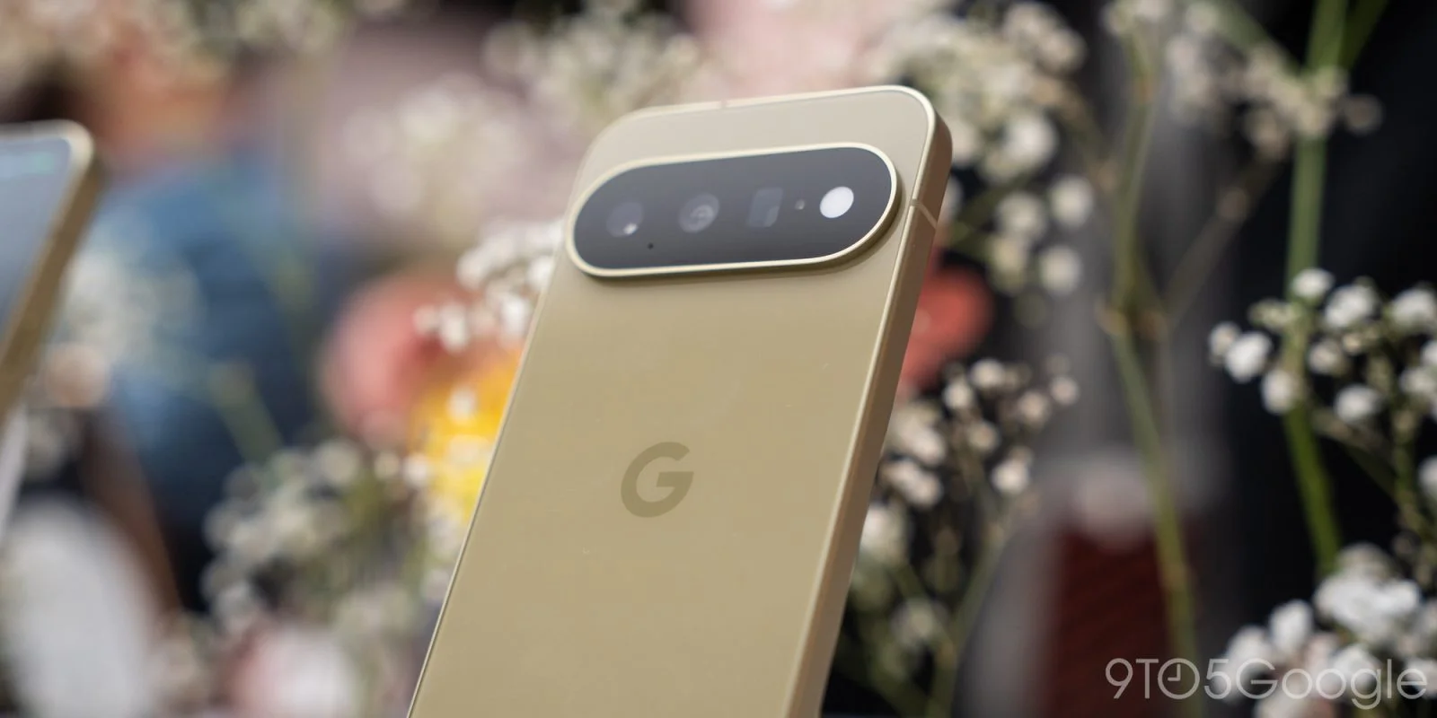
Google’s latest Pixel 11 has introduced a color that has sparked quite a conversation—its "Pistachio," which doesn't quite represent its namesake. The initial visual appeal wears off quickly, leaving many to question whether it should more accurately be labeled as “old avocado.” There's an irony here; while the Pixel branding has often been synonymous with vivid aesthetics, this attempt seems to tread a murky path.
Color Options: A Look at the Palette
The Pixel 11 is available in four color options: Pistachio, Hibiscus, Frost, and Obsidian. Among these, Pistachio stands out but not always for the right reasons. While the color palette in other Pixel generations has evoked strong attachment through vibrant tones, this particular green appears disappointingly muted. One can almost hear the hopes of fans clashing with their reality when they unbox the device. This isn't just a styling choice; color can influence buyers’ emotional connection to a product, and the muted tone might undermine that bond.
Comparing Greens: The Pro and XL Versions
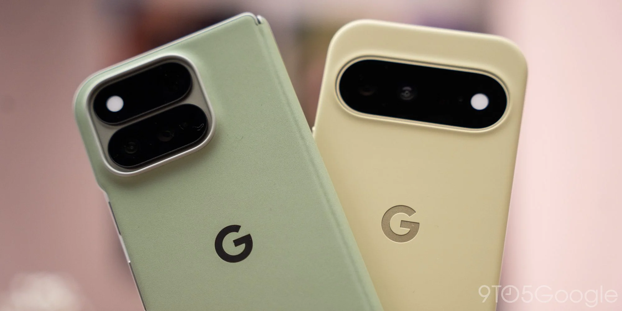
In the lineup, the Pro and Pro XL versions sport a more appealing green known as Olive, which showcases a richer hue compared to the baseline model's Pistachio. The Pixel 11’s color seems opaque, lacking the lively saturation one might expect from a name associated with a bright, inviting snack. Here’s the thing: in a competitive market, especially in the smartphone arena, aesthetic choices can set a device apart or blend it into an ocean of sameness. The Olive shade might catch the attention of consumers looking for vibrancy, leaving the Pistachio looking weak by comparison.
Unexpected Contrast: The Case Dilemma
What’s perplexing is the contrast seen when pairing the Pistachio with its official case. The case presents a vivid inner lining that makes the color of the phone seem drab by comparison. This is the part most people overlook: when accessories amplify the subtlety of the dye in the main product, it can leave potential buyers second-guessing their choices. If the handset mirrored the case’s brightness, user reactions might have been significantly different. It's a conundrum that speaks to a larger issue in smartphone marketing—accessories should ideally complement rather than detract.
Aesthetic Wins Amid Color Criticism
Aesthetically, the Pixel 11 has some wins outside of color discrepancies. The matte side rails are a personal favorite over the glossy finishes seen on the Pro models, which look somewhat generic against the Olive hue. That said, the subdued sheen of the Obsidian is also a noteworthy highlight, contributing to a more sophisticated overall appearance. Matte finishes have gained traction lately, often seen as a more premium look that avoids fingerprints and smudges often visible on glossy surfaces. But how much can these design choices mitigate the broader color debate?
Mixed Reactions: Consumer Connections
As hands-on reviewers continue to express mixed feelings about Pistachio, the phone itself has left some wondering where this daring choice fits in Google’s design ethos. How deep of a connection would consumers form with a color described as too dark for the vibrant fruit it’s named after? If you're working in this space, consider how emotional branding plays into consumer behavior. Colors can evoke memories or feelings, and a name like "Pistachio" might conjure images of brightness and fun—images that the actual product fails to deliver.
Personal Preferences: A Spectrum of Aesthetics
Each color offers a unique take: while I find the muted Pistachio oddly unexciting, others might prefer its subtleness. Yet, the critique remains that if Google wanted to evoke the freshness of a pistachio nut, they missed the mark entirely. It raises an essential question for tech companies about the balance between stylistic risk-taking and market expectations. Consumers tend to gravitate toward products that make a statement, and a muted tone might feel like a retreat from that.
Consumer Choices and Future Implications
Looking ahead, potential buyers can still find some appealing alternatives. With the Pixel 11 now available for pre-order, consumers are left pondering whether they should embrace the Pistachio or stick with the more vibrant options available. Google faces an uphill battle in appealing to buyers who value aesthetics as much as technology. The reaction to Pistachio might even serve as an indicator of how color influences purchasing decisions in the phone market going forward.
If the consumer feedback is anything to go by, it suggests that companies may need to rethink how they approach color selection. With competition heating up among smartphone makers, particularly when every brand is chasing unique selling propositions, a more engaging color palette could mean the difference between a sale and a pass. As the conversation continues, Google may want to consider this feedback seriously—after all, aesthetics matter.
Discussion
Sign in to join the discussion.