Apple Music 7.0 updates Android with translucent navigation, redesigned artist pages and a cleaner interface aligned with iOS 27.
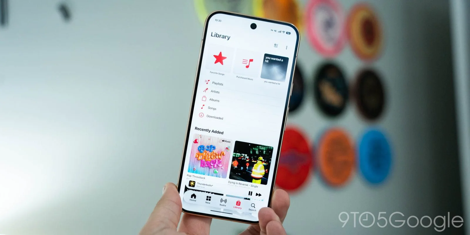
Apple Music 7.0 gives the Android app a broad visual refresh, bringing its interface closer to iOS while adapting Liquid Glass styling to Android. After a month in beta, the update is now rolling out widely through the Play Store. The release touches navigation, artist pages, library controls, and the app’s color system, making it more than a change to a few decorative details. Still, the update’s value depends on how much you care about visual consistency and small adjustments to daily use; the source doesn’t point to major new listening features.

Translucent controls reshape navigation
The most visible shift is a floating bottom bar, with a modest translucent finish that lets solid colors behind it show through. The mini-player now floats independently instead of sitting within the bar, while the updated system status and navigation areas extend the app’s edge-to-edge layout. These pieces make the lower portion of the screen feel less like a stack of fixed panels and more like a set of controls arranged over the content. That change is primarily visual, but the placement of persistent controls can affect how quickly users recognize where to go next.
There’s a notable difference from Apple’s iOS version: scrolling on Android doesn’t shrink the navigation bar. That leaves the controls more consistently present on screen, even as the content moves. The distinction matters because visual parity between platforms doesn’t require identical behavior, and Android users may find the persistent bar easier to track while browsing. It also means the iOS comparison has limits: the shared styling doesn’t make the two apps behave exactly alike.
The app’s color system has changed, too. Blue replaces red as the accent color, and the music note icon now appears in black or white to match the device theme, replacing the red-backed version. These are small choices in isolation, but color is one of the fastest cues an interface gives a user about its identity and controls. Apple’s move away from the previous red treatment makes the Android app feel less tied to its earlier visual language. A calmer palette, with fewer competing signals.
Artist pages and library controls get attention
Artist pages now draw their background colors from the artwork, with a prominent play button and an information page. The share control has moved to the upper-right corner, bringing the layout in line with iOS. Pulling colors from an artist’s imagery gives each page a more tailored appearance, while the prominent play button keeps the main listening action easy to spot. The information page also gives the artist view a clearer destination for supporting details, though the source doesn’t describe what information it contains.
Elsewhere, page titles and overflow menus share a row, and three-dot controls now sit in circular containers without the former red treatment. The Library menu adds “Edit Pins” and “Edit Categories,” while Settings has been reorganized into clearer groups. These adjustments speak to a familiar problem in music apps: as libraries and customization options grow, small controls can become harder to find. Grouping related settings and making pin and category editing explicit may reduce that friction. And this is the part most people overlook: interface changes can matter most when they remove repeated moments of uncertainty, not when they introduce a flashy new screen.
For listeners who already know where everything is, a rearranged menu can initially feel like extra work. But the updated labels offer a more direct account of what can be changed in the Library, and the revised grouping in Settings suggests an effort to make options easier to scan. The description doesn’t establish how much the menus have changed in practice, so the benefit will depend on the details users encounter after installing the update. If you’re working through a large music library, clearer controls for pins and categories could be more useful than the surface redesign suggests.
What version 7.0 changes for Android listeners
Now Playing sees no major changes, reflecting the limited updates to that screen on iOS. Apple recently aligned Android’s version numbering with iOS; version 7.0 corresponds to iOS 27. For Android listeners, the release’s value is mainly in a more coherent visual system and refreshed artist and library screens, with navigation behavior that still differs from Apple’s platform. That makes this update a useful example of platform alignment with boundaries: Apple is carrying over a recognizable design direction while retaining at least one behavior specific to Android.
This is more significant than it looks for users who switch between Apple devices and Android, because familiar layouts can make an app feel less like two separate products. The update still leaves a practical question: whether the refreshed screens make common tasks easier or simply make them look more consistent. A month in beta suggests the design had a period of testing before its wider rollout, but the available details don’t establish how users responded during that period or whether further changes are planned. Here’s the thing: a visual refresh earns its place when it improves orientation without getting in the way of the task at hand.
That said, the limited change to Now Playing keeps expectations in check. The release doesn’t appear to recast the listening experience; it concentrates on the surrounding interface, especially navigation, artist discovery, and library organization. For listeners who spend most of their time on the playback screen, the upgrade may feel modest. For people who browse artists or manage their library often, the revised structure may be more noticeable. The difference will come down to routine, not the version number.
Discussion
Sign in to join the discussion.