Gemini Live’s new Android menu lets users add photos, files and Drive content during a session, with screen sharing and camera controls repositioned.
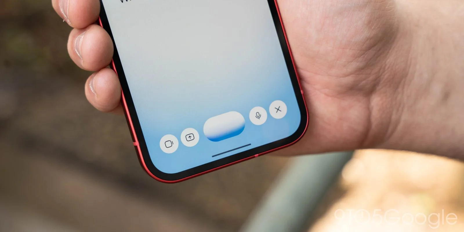
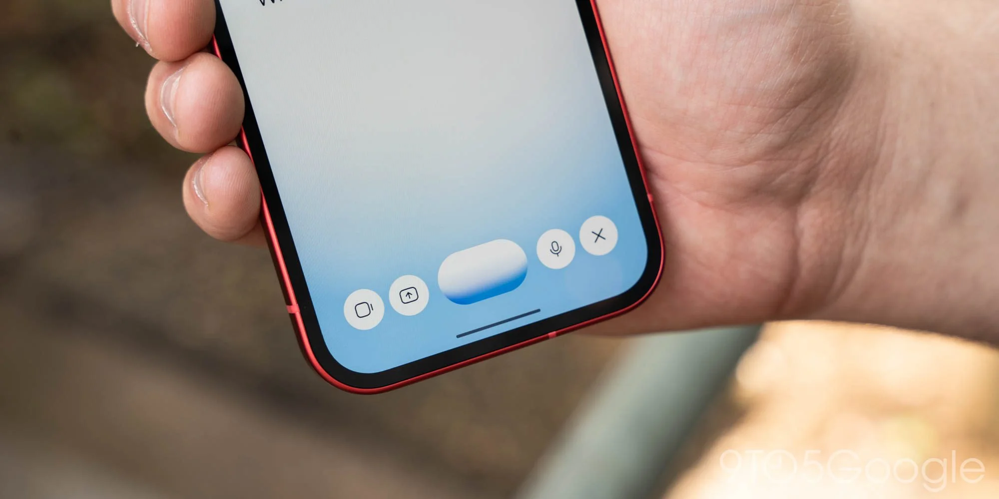
Gemini Live on Android now makes it easier to bring reference material into a conversation while it’s underway. Google is adding a plus button to the live interface, changing how users attach photos and files compared with the previous setup. The change addresses a practical limitation: a conversation can begin without every useful image or document already selected. When a question leads somewhere unexpected, users can now add material at that point instead of backing out and preparing the session again.
Adding context during a live session
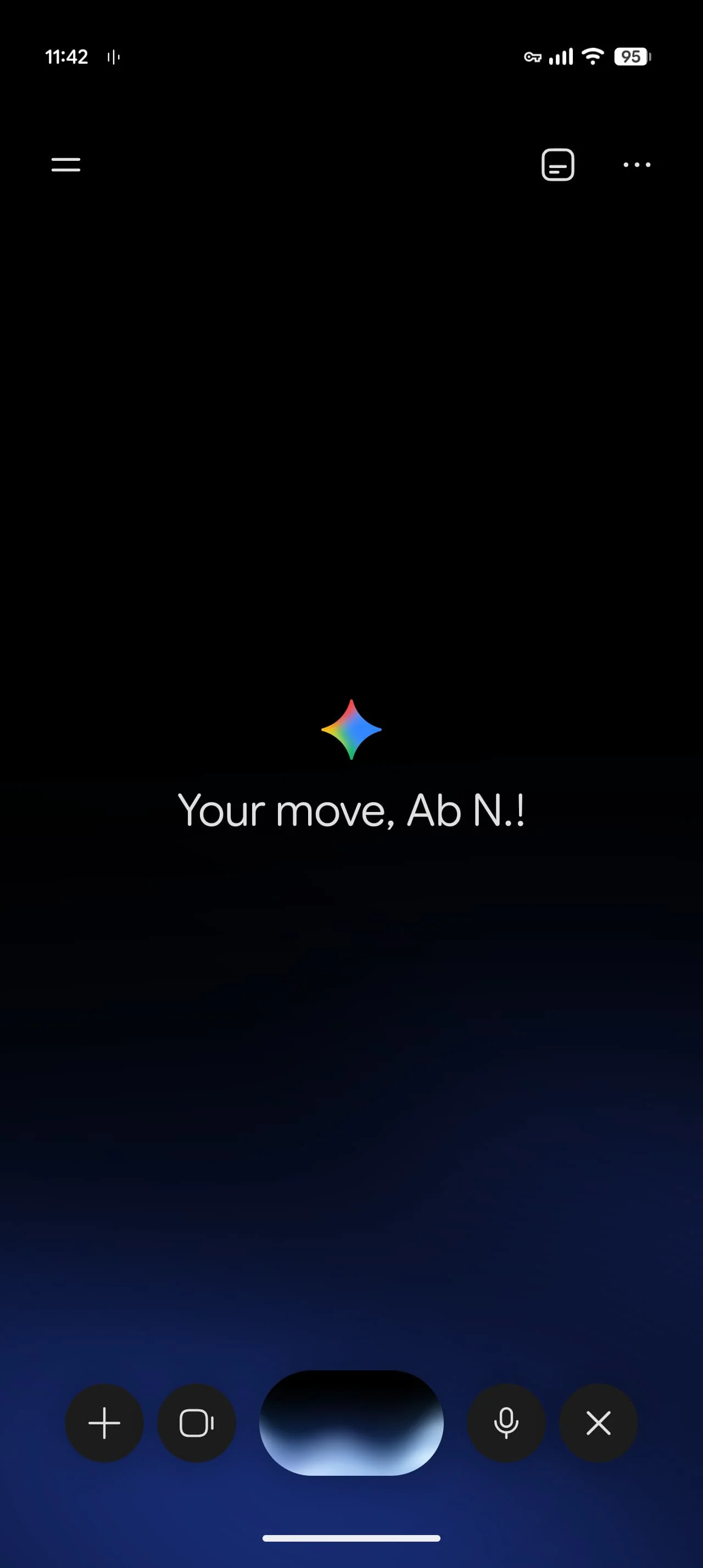
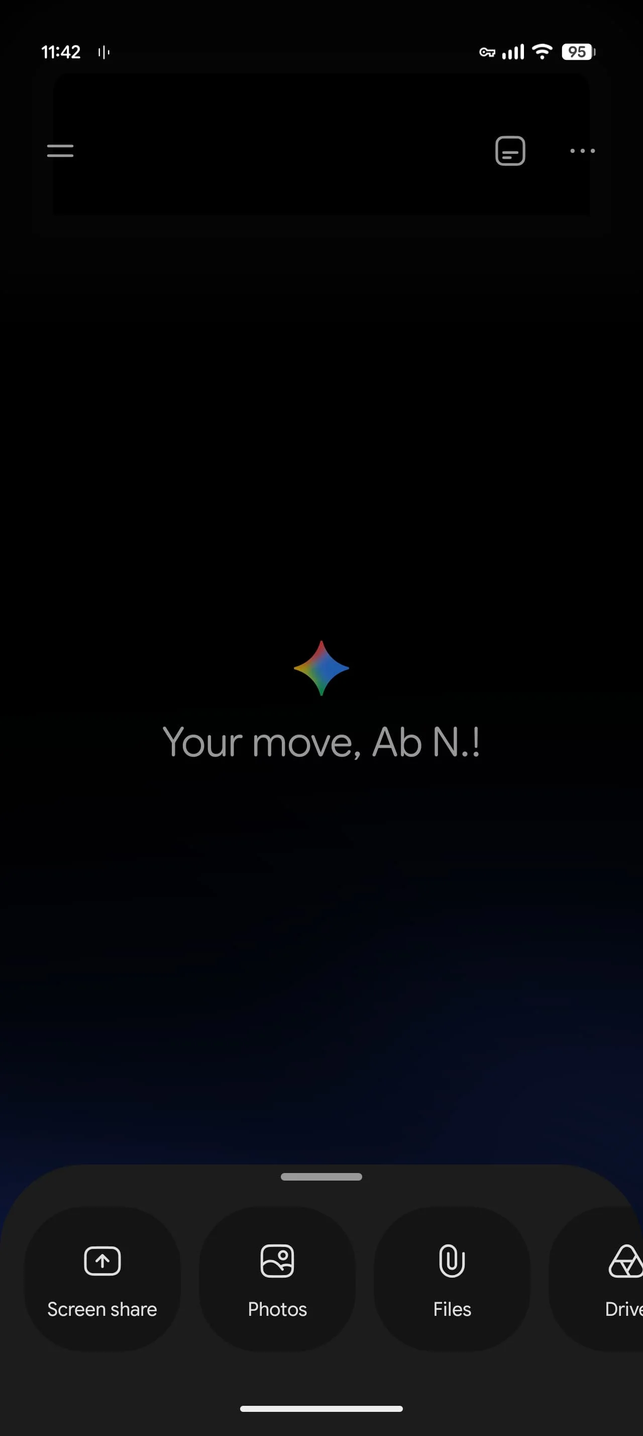
Tap the new plus button on the left side of the screen to open a carousel of options: Share screen, Photos, Files and Drive. Before this change, users had to add items through the Gemini overlay before starting Live. The new menu puts those sources within reach during a session. That’s a meaningful change to the order of operations: users can start talking first, then decide which material would help explain the question or task.
The listed sources serve different purposes. Photos can bring a picture into the discussion, while Files and Drive offer ways to point Gemini toward stored documents. Share screen can provide a view of what’s happening in another app. The article doesn’t specify which file formats are supported or how much material can be attached, so the menu’s presence shouldn’t be read as a promise that every item will work in every situation.
There’s a small tradeoff: screen sharing now takes an extra step. The camera control has also moved beside the waveform. Google has left the microphone mute and close buttons on the right where they were. That rearrangement matters because live interfaces depend on quick access: users may be speaking, looking at the screen and choosing controls at the same time. Even a modest change can make familiar actions require a moment of relearning.
The menu appears when Live is opened inside the Gemini app. It isn’t available when users start a session from the Gemini overlay, so the entry point still determines which controls they see. That distinction complicates the idea of one consistent Live experience. Someone who launches the same feature in a different way may find a different set of options, which can make the new attachment flow easy to miss.
Here’s the thing: the main improvement is less about adding another button than about letting the conversation change direction without a restart. A user might begin with a broad question, then realize a photo, file or screen view would clarify what they mean. The new flow puts that next step closer at hand. (And this is the part most people overlook: a useful assistant depends not only on what it can answer, but also on how easily a person can provide the context that makes an answer relevant.)
Less friction, with one extra tap for screen sharing.
For users, the practical result will depend on how often they reach for reference material during a session. If you’re working through a document or asking about something visible on your device, being able to add that context mid-conversation could save a detour. For a quick spoken question, the new control may simply sit unused. That’s a reasonable distinction: this is a workflow improvement for particular moments, not a change to every exchange with Gemini Live.
Availability
The update is appearing with Google app stable version 17.68. Google hasn’t brought the plus menu to iOS yet. For Android users, the change makes it more practical to introduce files and images after a Live conversation has already begun. The rollout detail gives Android users a version to watch for, but it doesn’t establish that every device has received the menu at the same time.
The iOS gap also means the feature’s availability depends on platform, while Android users still need to launch Live from within the Gemini app to see the new controls. That’s a narrow path for a feature meant to make adding context feel immediate. Google may extend the same menu to other entry points or platforms later, but the information here doesn’t say that it will.
Why the small interface change matters
This is more significant than it looks, though its value is specific. Conversational software often asks people to adapt their questions to the tool’s input flow: prepare the material first, then start the exchange. Moving attachment options into an active session reverses that sequence. The person can discover what’s needed through the conversation itself and supply it when the need becomes clear.
That said, easier access doesn’t answer the larger product question: how well does Gemini use the material once it’s shared? The update described here changes the interface, not the assistant’s ability to interpret a particular file, image or screen. The distinction matters. A smoother way to submit context can remove one point of friction, but the quality of the experience still depends on what happens after the tap.
For now, the clearest test is mundane: whether people can find the plus button, choose the right source and continue without losing the thread of the conversation. If they can, the extra control earns its place. If the different launch paths keep producing different menus, users may need to remember a product detail before they can use the feature they came for.
Discussion
Sign in to join the discussion.