Exploring Googlebook OS: Merging Mobile Usability with Desktop Enhancements
Published Oct 12, 2026660 readers
Googlebook OS offers an intuitive interface for Pixel users, blending mobile familiarity with desktop capabilities, though some features need clarity.
The Challenge of Redefining Desktop Experiences
Bringing mobile usability to PCs has proven to be a significant hurdle, and past efforts have been met with mixed results. Whether it was Microsoft's ambitious Windows 8 initiative or Apple's attempt to integrate touch capabilities into the Mac ecosystem following the iPad's success, none have truly captured the essence of the touchscreen experience. Ironically, while Apple’s iPad was expected to pave the way, it ultimately fell short, hampered by its iOS limitations that restrict user freedom and customization.
Now, after spending over a week immersed in Googlebook OS, it’s evident that Google is exploring new ground with potential promise. Although its redesign signifies a substantial strategic shift, the execution still leaves much to be desired. Googlebook OS takes inspiration from ChromeOS, but its actual performance evokes the feel of Android in a desktop environment. Despite this, it’s clear that this new OS is a more refined version compared to previous attempts at large-screen Android functionality, particularly when using a Pixel device connected to an external display.
User Familiarity and Integration
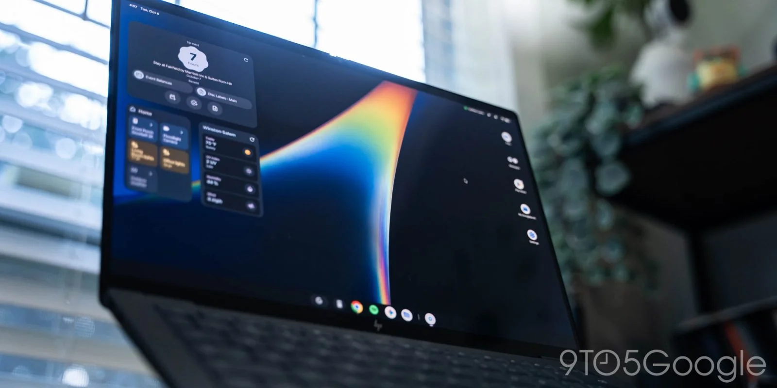
For those already using Pixel smartphones, transitioning to the Googlebook interface feels remarkably intuitive. The familiar Android status icons reside in the upper-right corner, and accessing Quick Settings mirrors the Pixel experience, minus a few minor adjustments like the absence of a volume slider. Notifications are centralized, providing easy management of alerts, and even the keyboard shortcuts bring an immediate sense of comfort for anyone versed in the Android ecosystem.
This familiarity extends to hardware integration on devices like the HP Googlebook 14. Here, physical keys serve practical purposes: the F1 key acts as the Android back button, while shortcuts for home navigation, screen captures, and volume control enhance the experience significantly. Yet, upon closer examination, some icons—particularly those for full-screen and screenshot functionalities—lack clarity, potentially confusing users rather than enhancing ease of use.
Feature Set and Usability Enhancements
One standout feature is the Magic Pointer shortcut, offering users the option to control the pointer without relying solely on gestures, which some may find cumbersome. Additionally, media controls on the screen provide fluid access to play/pause functions without the need for multiple clicks—a notable improvement over more conventional desktop setups.
Another interesting component is the Quick Insert key, which combines practical utility with a touch of personalization. It allows quick access to emojis, recent clips, and applications, making it easier for users to interact with their content without remembering complex shortcuts. Yet, despite these enhancements, the absence of certain desktop staples, like a dedicated text expander, does leave a gap for those used to a more customizable keyboard experience.
In the rush to create a seamless experience, there are oversights that detract from overall usability. For instance, the fullscreen flash effect when taking screenshots can be jarring, particularly on larger displays, and the notification center could benefit from a less intrusive approach—common annoyances that track back to the mobile legacy.
A Look Ahead
As promising as Googlebook OS appears, it’s important to temper enthusiasm with a recognition of its limitations. For professionals in tech or users heavily invested in maximizing productivity, understanding both its innovations and its shortcomings is essential. Is this an operating system that can finally bridge the gap between mobile and desktop? Perhaps, but it requires ongoing refinement to truly realize its potential in modern workflows.
Cross-Device Functionality Critique
Setting up your device is just the beginning; the seamless features across devices, touted by Google, won't be available immediately. This delay can sour a user’s first experience, but an even larger concern is the lack of support for Samsung right out of the gate—a significant oversight that raises questions about Google’s readiness for a broad launch. For anyone in the tech sector, this lack of interconnectivity is a glaring warning sign. If you're banking on synchronized features across platforms, this is a substantial red flag.
Chrome's Adaptation
Underneath, Chrome running on Googlebooks is a mobile adaptation rather than a full desktop experience. It does add some features you’d expect from a desktop browser, like extension support and vertical tabs, but overall, it feels like Chrome Lite. It's compatible with most websites—no major hiccups there—but don't expect it to perform like your typical desktop Chrome. Features that we take for granted, such as context menus on right-clicks and easily searching settings, are either missing or frustratingly inconsistent. The experience can feel overly simplified; it’s the browser equivalent of a stripped-down model.
For this first iteration, I hoped for a more comprehensive feature set but am left wanting. Chrome has been part of millions of users' routines for years, and any inconsistency only serves to remind us of what’s lacking. Google needs to listen: we want that familiarity back, not a half-hearted version.
AI Capabilities: Mixed Bag
When it comes to AI integration, Google’s approach with features like Magic Pointer and Circle to Search creates an interesting but somewhat cluttered user experience. The intent behind Magic Pointer—a simple, intuitive gesture—works well, but having two overlapping features invites confusion. Both are capable of enhancing workflow, but they don’t make for a clean or focused experience.
Rambler, Google's voice recognition tool, is a standout feature that I found surprisingly useful. It’s easy to overlook when you’re accustomed to the tactile feedback of a hardware keyboard. Meanwhile, the Create My Widget feature shows Google's push towards customizability—allowing users to curate their own information feed is smart. I've been testing it out for tracking sports scores and countdowns, and it’s fun and functional at the same time. Yet, the two-pronged AI approach feels like Google hasn’t fully committed to a single strategy, leaving some of its potential on the table.
Apps and Usability
In terms of apps, this platform is reminiscent of the Chrome OS philosophy: your web browser can basically handle all your work. I’ve been resizing many native Android apps to mimic their phone counterparts, which helps me navigate more comfortably. Google’s choice to use Trusted Web Activities for its Workspace apps—essentially Progressive Web Apps that support widgets—is sensible. However, there remains a disconnect between web and Android versions that I wish Google would address. The tension between developer autonomy and ensuring consistency across experiences leaves me uneasy.
For example, having Google Messages function merely as a webpage is a frustrating holdover from past devices and one that detracts from the overall experience. While some native apps, like Keep, provide an uplift, others fall short of expectations, leaving us wishing for a more coherent strategy. The inconsistency in how text input fields behave in mobile apps can act as a barrier, not a bridge. For many, tapping the screen to activate a text box rather than simply typing can be an unnecessary hurdle, only serving to complicate what should be straightforward.
Native Applications Overview
Looking at the native offerings, each app carries a distinct purpose—though not all are as polished as they could be. The Files app is a decent representation of what you might find in ChromeOS, complete with convenient AI-generated file summaries. In contrast, the Text app comes off a touch clinical, more focused on functionality than user experience, while the Viewer is notably basic compared to alternatives like macOS Preview.
Then there's the "My Googlebook" app, which oddly serves as a hub for widgets showing data from Google Calendar, Drive, and Keep. It feels like a mix of ambition and confusion, a reflection of what could have been a simple central dashboard. Overall, the push for user-friendly design is marred by inconsistencies that can frustrate daily productivity. Google’s ecosystem is formidable, but the execution here is, unfortunately, hit or miss.
Final Thoughts on Googlebook OS
The launch of Googlebook OS signals a pivotal moment, not just for Google but for the mid-range laptop market at large. This latest effort looks to broaden the functionality of Android and finally offer a true desktop experience, yet it’s hard to ignore a glaring problem: the persistent app gap that Chromebooks have faced for years. While some Android apps have started to bridge the divide, the absence of mainstream desktop applications—think Adobe’s suite—remains a significant hurdle. Expecting users to transition to a new platform in 2026 without these essentials is a hefty ask, especially when many rely on robust applications for daily tasks.
Here's the thing: during my week of usage, I discovered that Googlebook OS has managed to implement some smart features that cater to power users. This isn't merely Android diluted for laptops. However, for those who depend on a well-mapped ecosystem and deep integration, particularly in creative fields, the platform’s limitations might deter them. The general consensus seems to be that while Googlebook OS has its merits, it isn’t entirely ready to compete against established players like macOS and Windows, which still boast a more polished user experience.
That said, there is ample potential for Google to evolve this operating system. It will require quick iterations and targeted enhancements to address the initial shortcomings. For someone like me who operates mainly in browser-based environments, the Googlebook makes practical sense but lacks the finesse and charm that keeps users loyal to more mature systems.
In conclusion, if you’re considering a shift, weigh your needs carefully. If web apps meet your requirements, Googlebook OS could be a viable solution. But for others—a creative professional using specialized software—the limitations are already clear. Google has a mountain to climb, but they’ve laid a solid foundation to build on. That’s something worth tracking as they continue to expand on this platform.
Discussion
Sign in to join the discussion.