The Google Sheets icon undergoes a notable 180-degree rotation, aligning better with user expectations, though some questions linger about the change.
Icon Update Overview
Following the May redesign of the Google Workspace suite's icons, the Google Sheets icon has received a subtle but significant update. Icon design not only reflects a brand's identity but also enhances user experience. In the case of Google Sheets, this update is part of a broader trend toward mobile-first design, emphasizing usability across platforms. As software evolves, it's vital to make sure that the icons we use are not just visually appealing but also functional.
Details of the Change
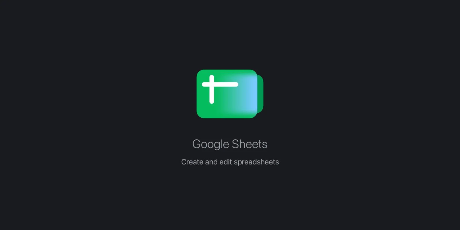
In this overhaul, Google rotated the Sheets icon 180 degrees. This adjustment positions the x- and y-axis indicators in the top-left corner, aligning visually with how the application is actually used. The design now features a second sheet peeking from the right, enhancing clarity. Such tweaks may seem minor, yet they hold importance in representing real-world application workflows. Users, especially those frequently working with spreadsheets, might appreciate these design changes for aligning more accurately with how they interact with the software. It reflects not just an aesthetic choice, but a functional one aimed at improving user recognition and efficiency.
Feedback and Perception
Upon its initial release, some users felt the design seemed askew. Feedback comes in various forms, and in this case, it appears that the initial rollout of the Google Sheets icon may not have resonated well with the user base. While some speculate that the recent modification indicates an oversight during the first rollout, it's more plausible that user feedback prompted this adjustment. Companies like Google invest heavily in user interface and experience testing. They recognize that even the slightest change can result in significant shifts in user satisfaction. Nevertheless, it's curious that this was the only modification made to the icon during this update. Other icons in the Google Workspace suite received more extensive redesigns, raising questions about the decision-making process behind this singular focus.
Industry Context and Comparable Cases
Changes in app icon design and functionality often reflect broader trends in software development and user experience design. Many tech giants routinely refresh their UI to keep pace with user expectations. For instance, Apple periodically reconsiders the icons of its applications—look no further than the annual updates during the WWDC conferences, where subtle shifts in design serve larger branding missions. Microsoft, too, revamped its Office Suite icons as part of its push for a unified brand identity across platforms. These examples show that updates can serve multiple purposes: a fresh look, improved usability, and aligning with current design trends.
Availability
The new rotated icon is currently available in the latest Google Sheets update for iOS. However, users on the web and the Android platform have yet to see this change implemented. This staggered rollout highlights the common challenge in the tech industry where software updates can lag based on platform capabilities and user impact analysis. If you're working in this space, you know that such phased implementations can occasionally frustrate users who feel left out or left behind when features aren’t uniformly released across operating systems.
Implications and Future Outlook
So, what does this mean for you and the future of icon design in software? As software companies continue to hone their applications, user feedback will likely play an increasing role in shaping design decisions. This is more significant than it looks; the implications can ripple throughout the entire tech ecosystem. Brands that prioritize user experience may see enhanced loyalty and engagement. Conversely, those that overlook feedback might face diminishing returns. With an ever-growing suite of collaborative tools aimed at digital nomads and remote workers, the need for clear visual communication will only intensify. Companies will need to navigate these landscape shifts carefully to maintain relevance.
(And this is the part most people overlook) — the actual impact of such updates isn't just in the iconography but also in how these companies read user sentiment and adjust course accordingly. The tech industry thrives on adaptability, and Google, with its gigantic user base, will likely continue to adjust its strategy based on this experience. For users and designers alike, this should serve as a reminder that even the smallest design decisions can make a significant impact on user interaction and satisfaction.
As we observe this trend, it will be interesting to see how other applications respond and whether they'll adopt similar strategies in user engagement and feedback assimilation. Overall, there's a growing acknowledgment that design goes beyond superficial aesthetics—it's fundamentally about making tools more accessible and intuitive.
Discussion
Sign in to join the discussion.